Little Einstein
Project Overview
Little Einstein is a new online retailer of curated and innovative learning kits for kids. It was formerly a beloved shop in Park Slope Brooklyn that sold all types of DIY kits (both analog and digital), but the storefront was too expensive and the shop closed in 2012. The owner wanted to convert the store to online only and the owner, Alberta, now wants to focus her inventory on technology and electronics products geared towards kids ages 4 - 15. The primary goal for Little Einstein is to become a resource for parents that want to incorporate hands on STEAM (Science, Technology, Engineering, Math, Art + Design) education into their child’s everyday learning experience.
Our goal was to create a new online store that would reflect the STEAM focused philosophy of Little Einstein by featuring new, innovative products, while at the same time maintaining the playful and creative vibe that was found in the old storefront.
Time: 4 weeks
Team: On this project, I worked with three other designers. While all members had a role in the design, research, and prototyping processes, my designated role in this group was implementing the interactions of our Axure prototype.
Methods: User flows, brainstorming, comparative analysis, card sorting, user research, live interviews, persona development, field research, paper prototyping, and Axure.
Process
Field Research
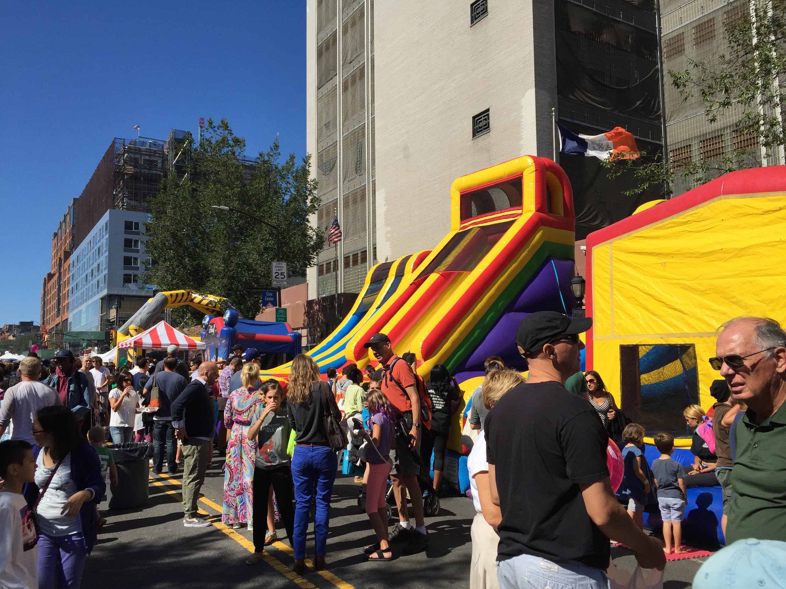
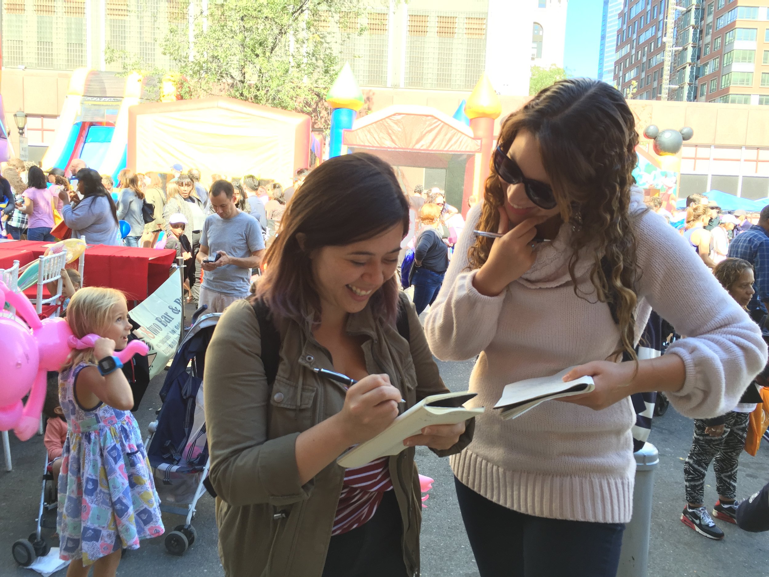
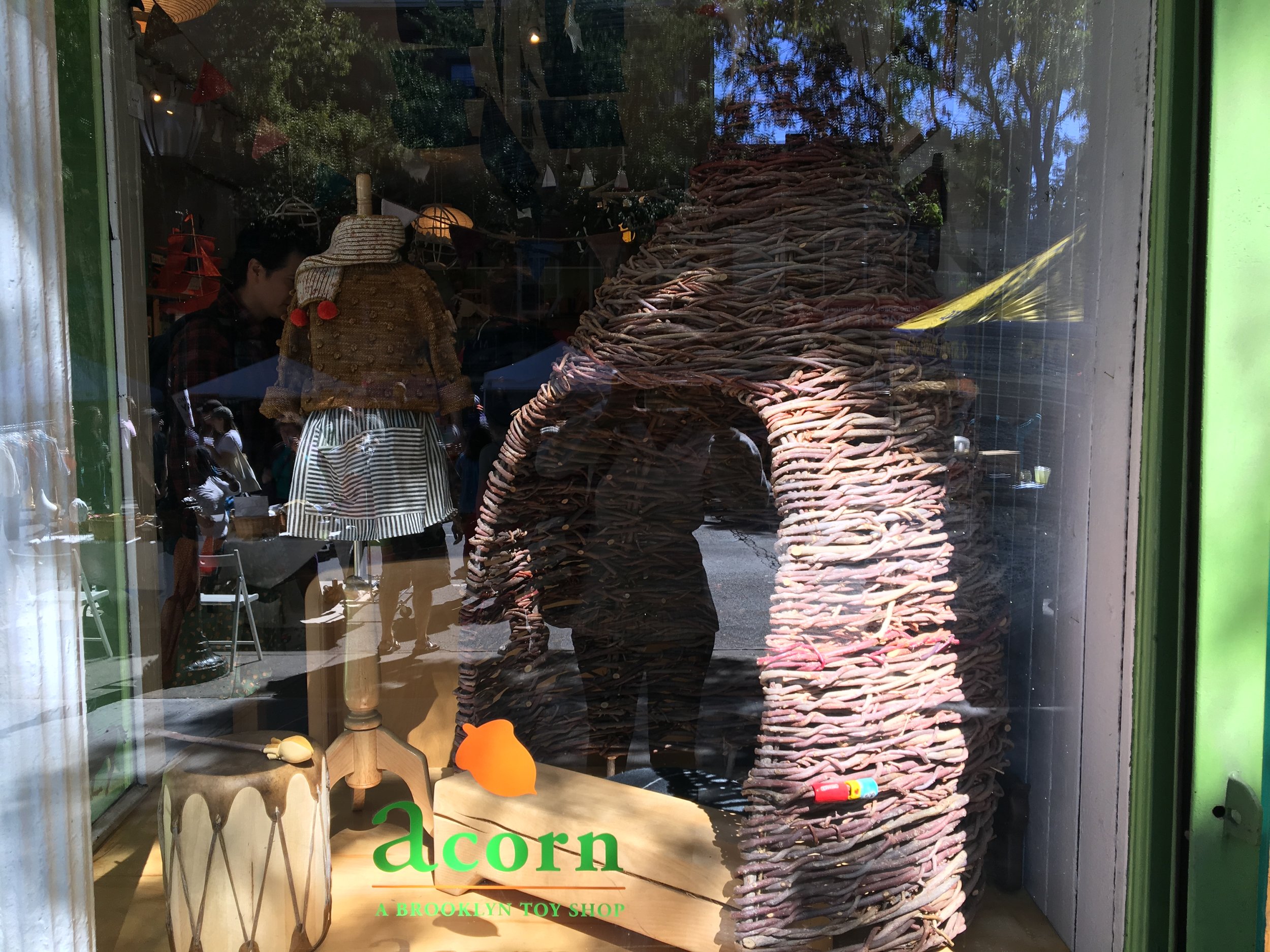
The team wanted to explore how to translate the community vibe to an online store and decided to do field research for inspiration. We visited the store Acorn at Atlantic Avenue, a store in the same neighborhood and demographic of the client’s original store, and interviewed nearby parents to explore their shopping behavior.
This field researched revealed several insights including that our demographic of parents rely heavily on reviews before purchasing, whether it is provided online or by child, and that the majority of them use Amazon’s search engine when they do buy online.
Brainstorming
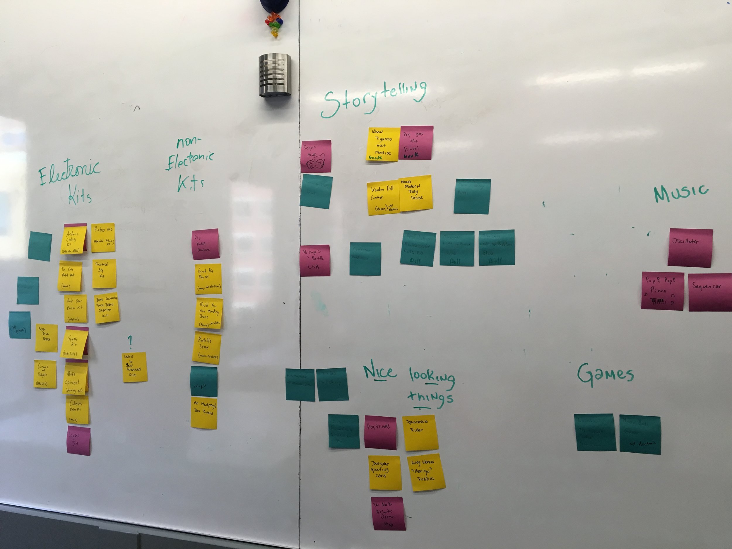
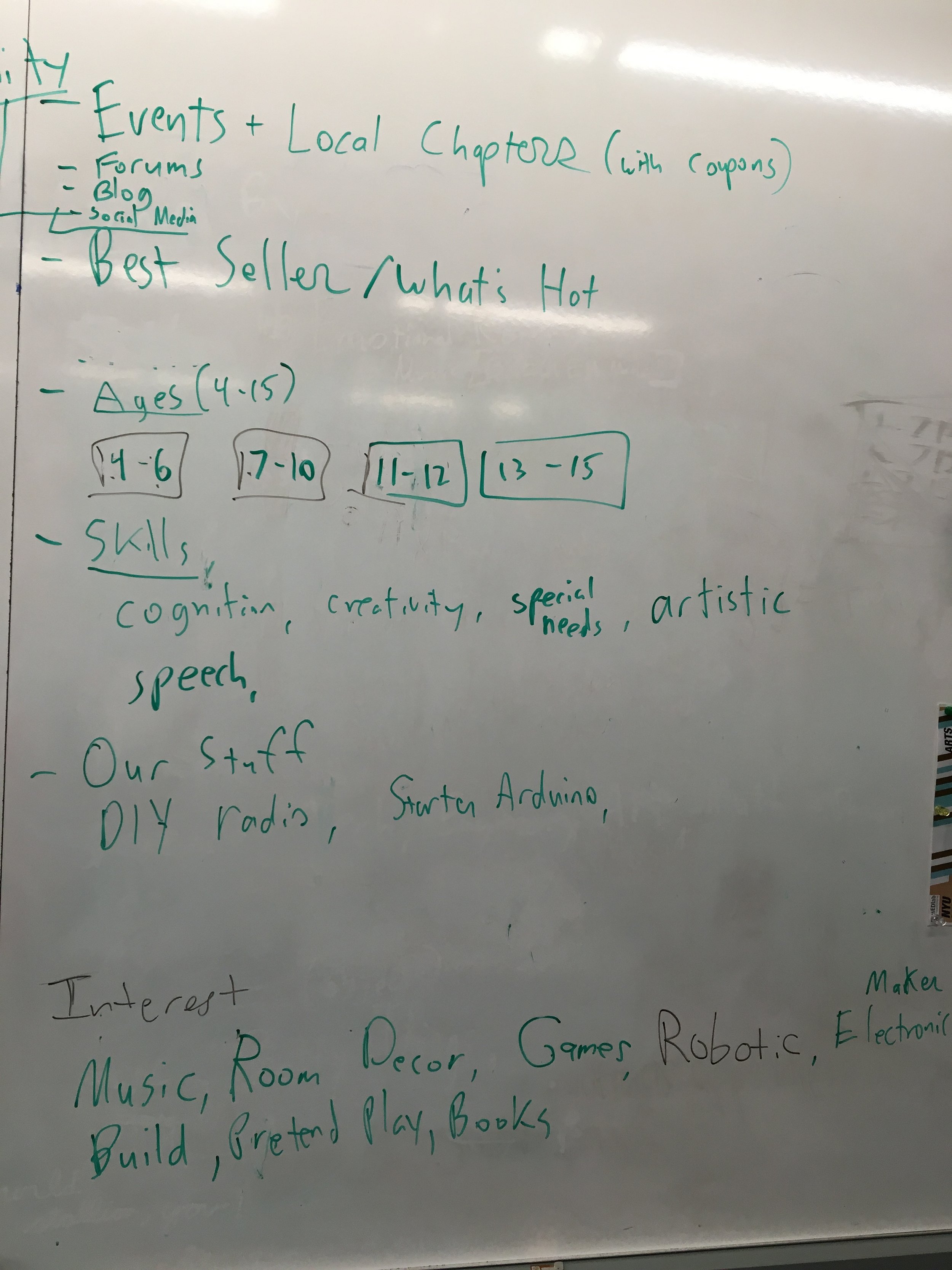
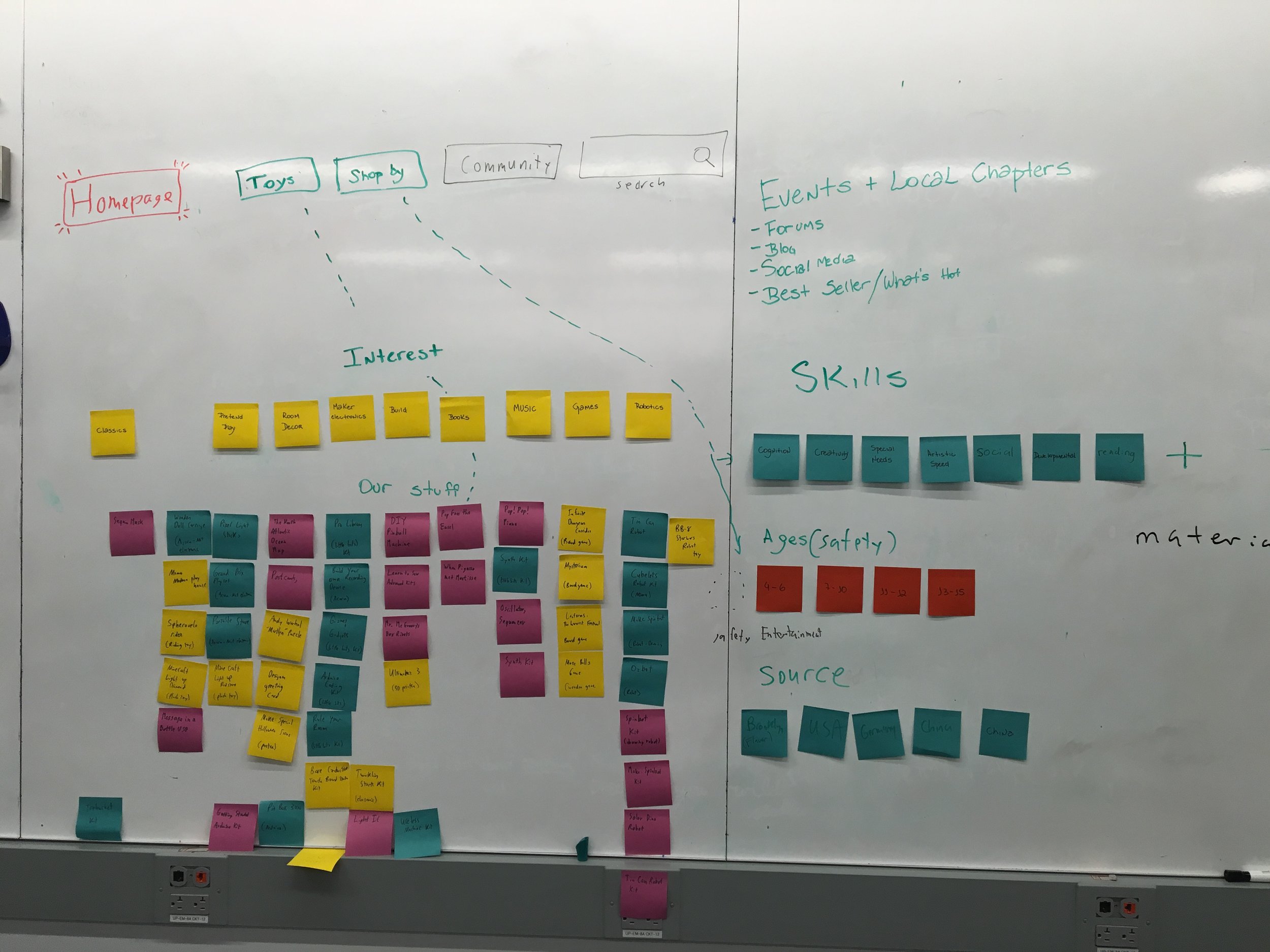
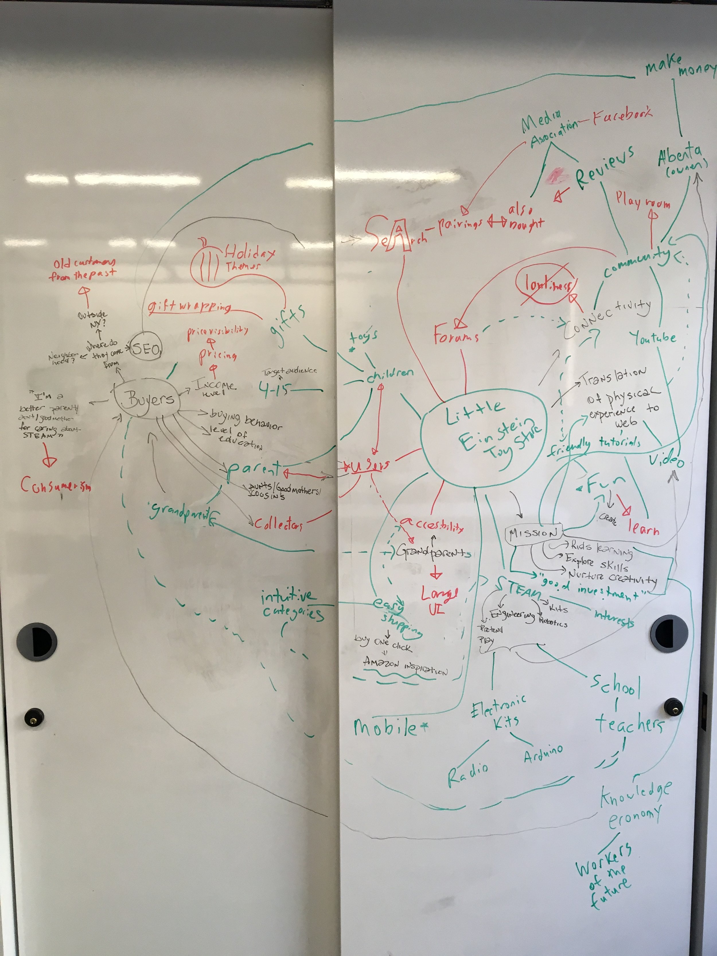
Our team had thorough brainstorming sessions where we performed several different exercises to pool our thoughts together including card sorting products that fit into STEAM and creating categories based on our example products. We also sketched a sitemap based on these categories and drew mind maps based on keywords from the client’s business goals.
Comparative Analysis
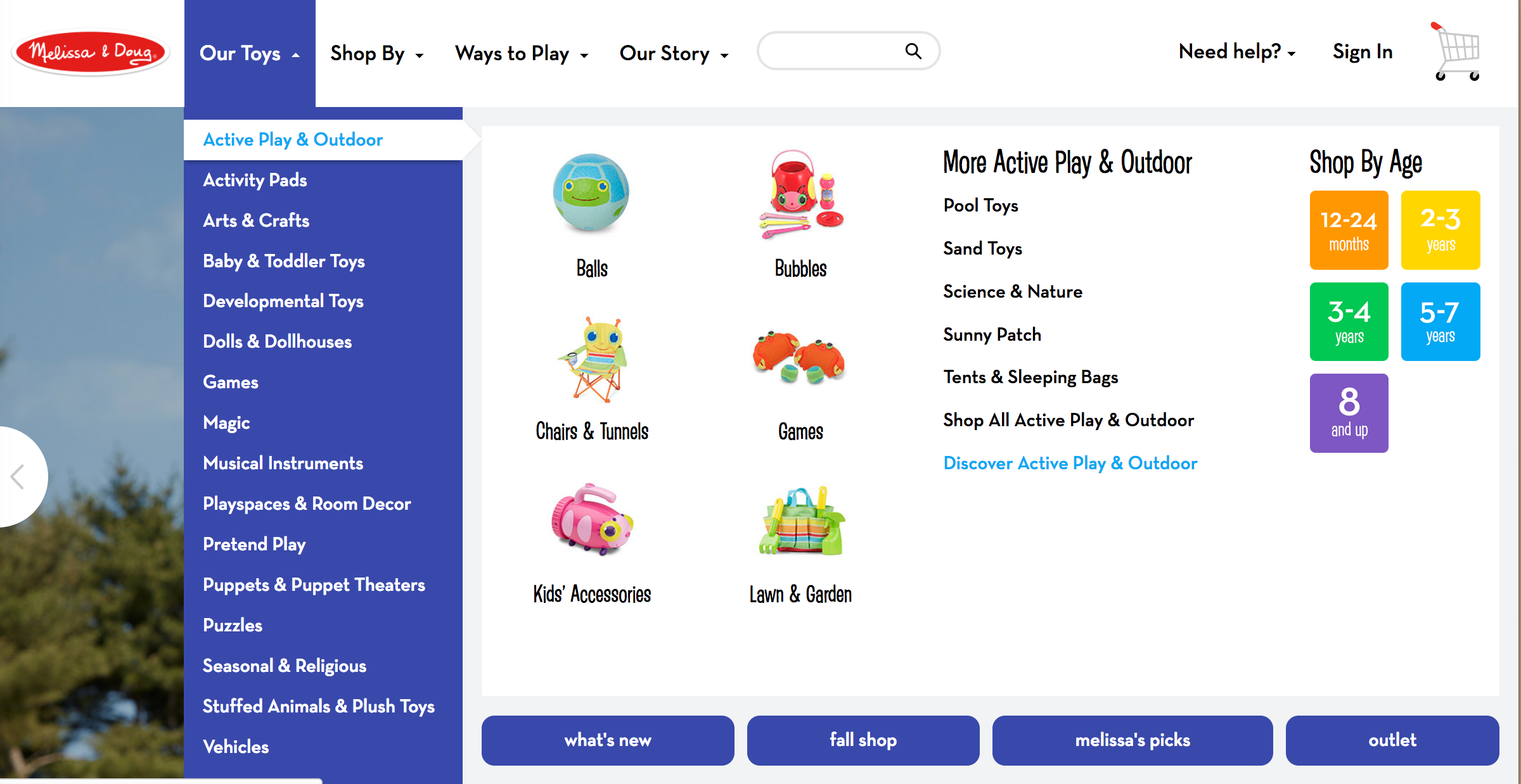
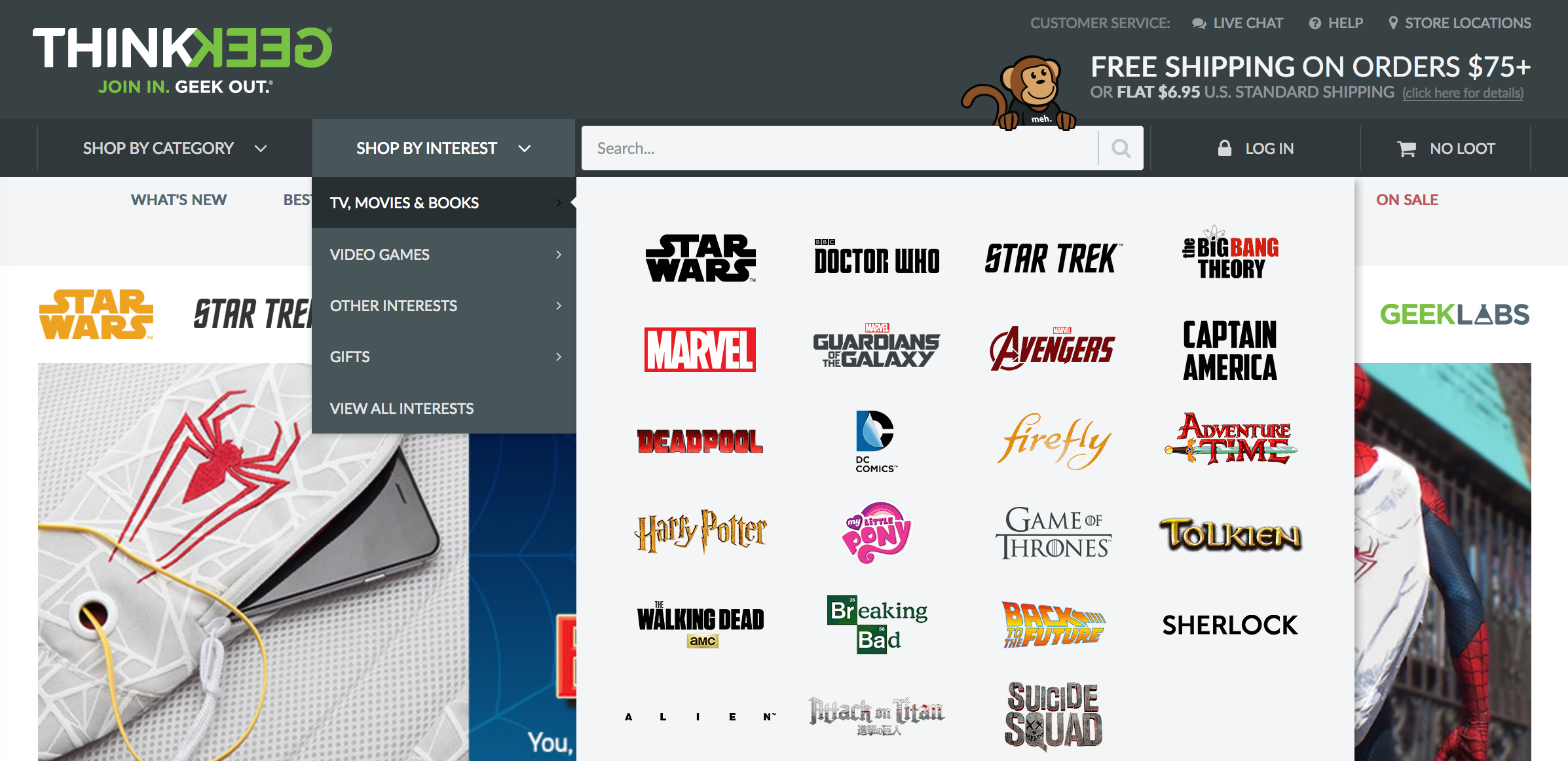
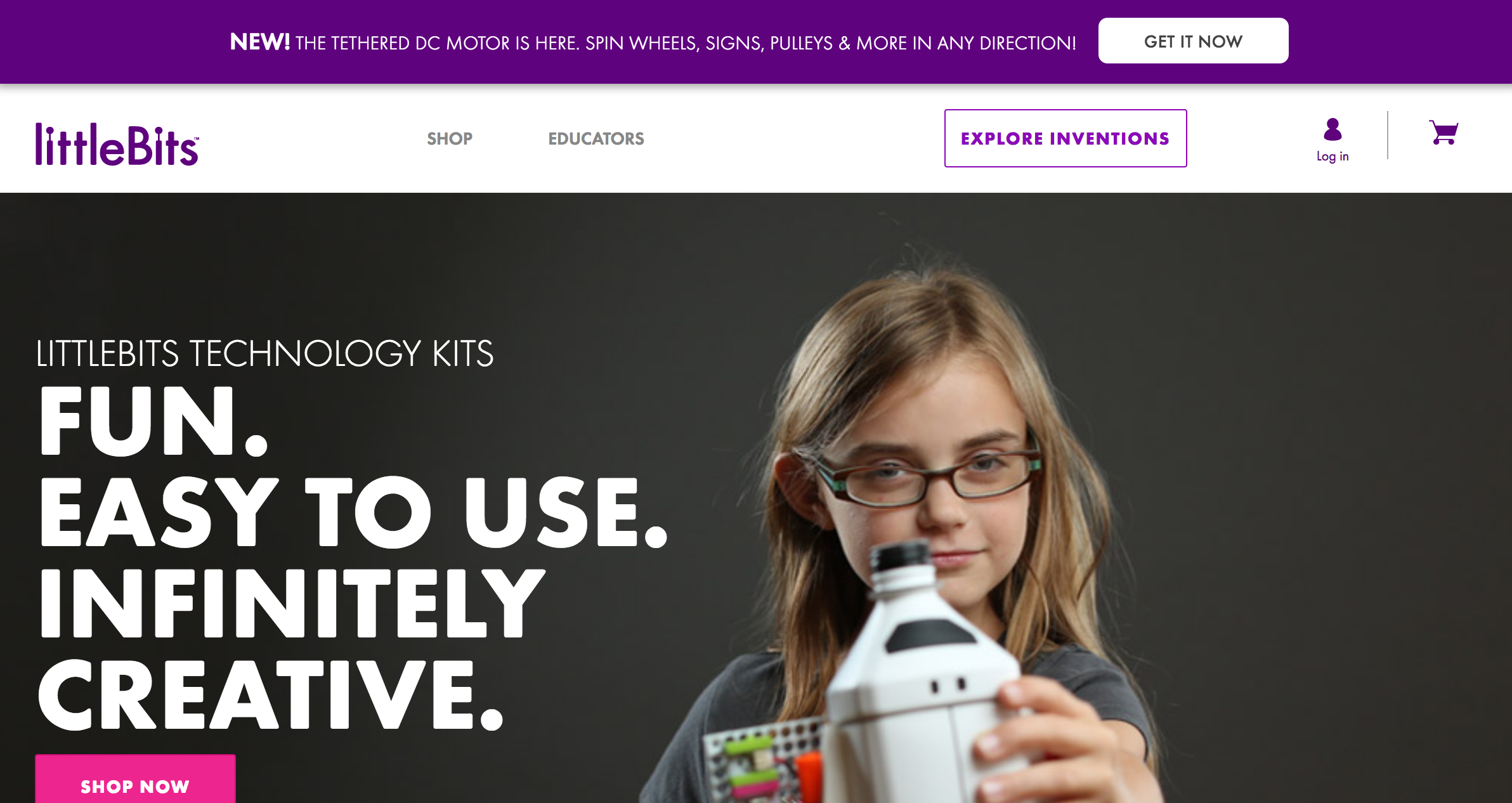
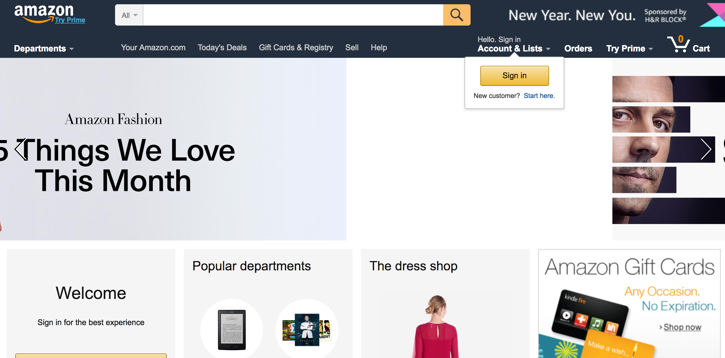
We also looked to existing online stores for the STEAM community and children for inspiration on how to organize the products and methods of creating an online community. We also compared the differences between the check-out processes between these sites and Amazon, as Amazon was the website that is most used by the parents found in our field research.
Fostering a Community online
A snapshot of the community page on our Axure prototype
A snapshot of the "Alberta's Picks" category on our menu
Our client had concerns about retaining the sense of community and human connection that she had at the physical storefront and feared that it would be lost when the store goes online. To meet our client’s needs, we brainstormed ways to try foster the same sense of community that the physical store had.
One example is our “Alberta’s picks” category. In the old storefront, Alberta mentioned that they would often pair “each toy with a children’s storybook, movie, show, or theme” and they “would like to continue doing that somehow online.” The “Alberta’s picks” category alongside a row that features recommended pairings for toys on product pages are meant to integrate Alberta more into the shopping process. We also added videos of the kids playing with the toys on the product pages as kids used to test the toys in person in the storefront. This allows the parents to continue to see children interact with the products, giving another level of dynamism to the shopping experience. We also added a community section to our website and created a meetup section, which would allow users to meet in real life. On our site, our upcoming event is Halloween at Prospect Park. We also removed the option of purchasing or writing a review without being a member - meaning that removed the option to be a “guest” at Little Einstein’s. By doing this, we build aim to build membership and loyalty.
Site Map
Little Einstein's Site Map
Our site map was mostly inspired by the websites we looked at in our comparative analysis.
Prototypes
Prototype #1: Paper Prototype
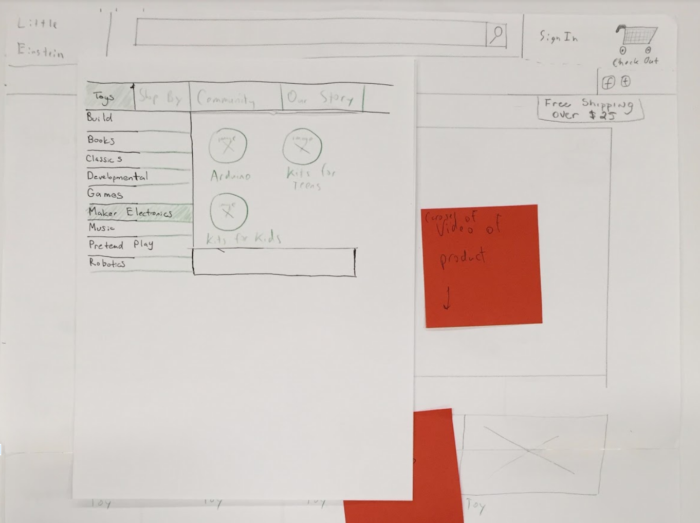
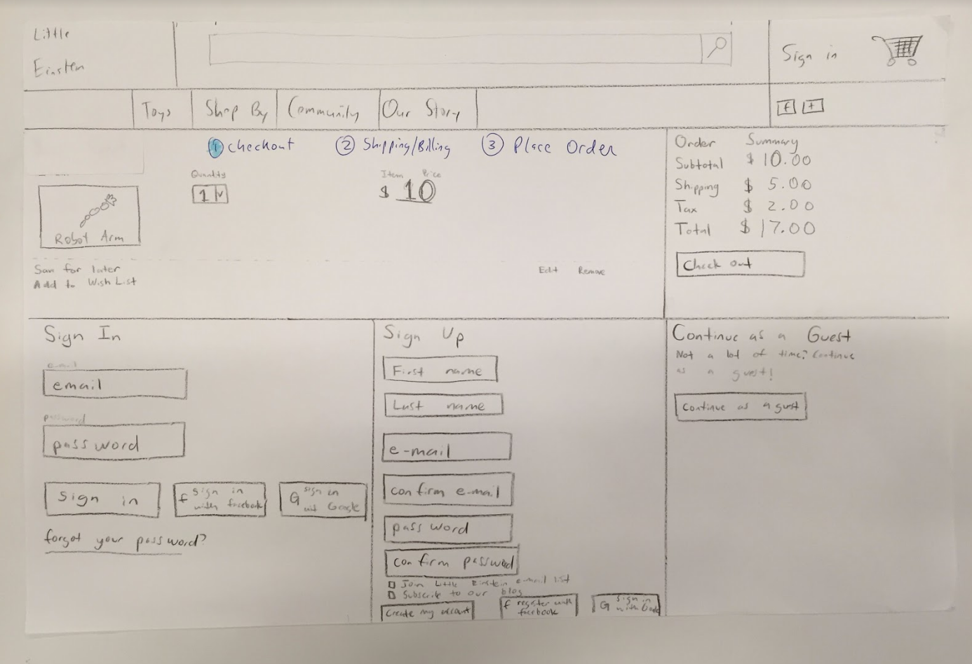
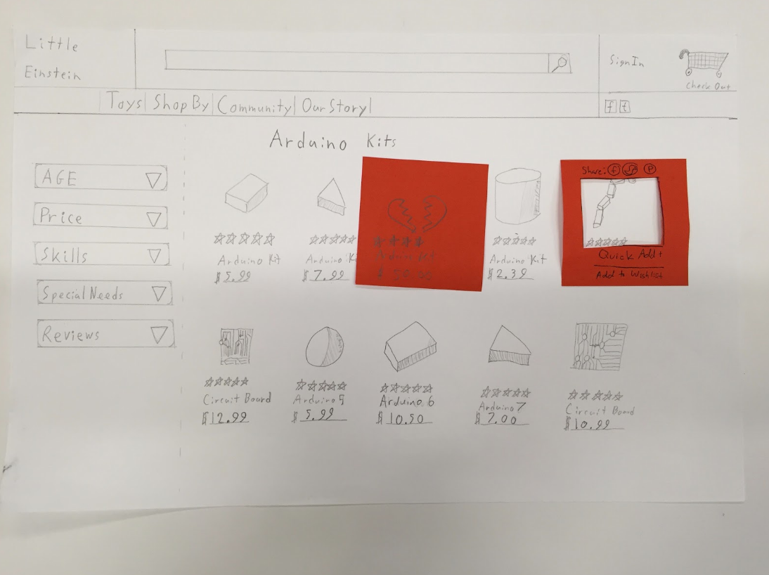
After the initial brainstorming and researching, we began to paper prototype solutions and potential schematics for the new Little Einstein website. After we each created our own paper version of the website, we pulled our work together, compared our ideas, and narrowed down features that we agreed on were best for the site. After creating a new paper prototype, we started user testing.
User Testing
For testing, we gave our users tasks to accomplish and observed how they would proceed. Our first task was for them to “find an Arduino Kit.” Our user testing results showed that the initial instinct for most when instructed to find the Arduino Kit was to go to the search tool. This lined up with our participants in our field research who mentioned that they immediately go to the search bar when shopping online for a toy on Amazon.The most consistent and persistent feedback we received from these tests was that the check-out experience could be more streamlined and that some of the steps were confusing. With these insights and feedback, we decided to move forward to reiterate our check-out process and put our prototype in Axure.
Prototype #2: Axure
After creating and testing the paper prototype of Little Einsteins, we reiterated on our design and created an interactive prototype in Axure.
A user types "dinosaur" into the search bar
A satisfied user at the confirmation page of their task
User Testing
Feedback from tour Axure testing sessions include the users telling us to reword action buttons in the check process (for example using “place order” on a button versus “submit”) and giving the user an estimate of the shipping time before adding a product to their cart. In regards to the community section, a user felt that the content could be reworded a little for clarity.
Based on their feedback, we reiterated the prototype again and addressed the concerns that were brought up to us about the check out process and our word choices for actions.
Conclusion
We believe we successfully responded to Alberta’s concerns and desires while building her a functional and easy to browse website. She wanted a site that would replicate the experience of being at her store and wanted a way to foster community. We believe we did that with videos of kids playing with toys and by creating a community section that would allow parents and families to talk online and meet up in person. Through thorough field research and comparative analysis, we also made sure that the website will be easy to navigate and meet our user's needs to search and check out quickly and efficiently.
Currently, I am redoing the Little Einstein Axure prototype to meet my aesthetics, which I look forward to share once it is completed.
